In this article, we will explore the world of bar charts, a versatile and popular tool in data visualization. They provide a straightforward way to represent categorical data and showcase patterns, comparisons, and trends. Whether you are a data analyst, researcher, or enthusiast, understanding the basics of bar charts is essential for effective data communication. Join us as we delve into the fundamental concepts, benefits, and practical examples of bar charts. Get ready to enhance your data visualization skills and unlock new insights with the power of these charts. Let’s get started!
What are the different types of Bar Charts?
Bar charts are a versatile visualization tool that can be adapted to different data scenarios and objectives. Here are some common types:
- Vertical Bar Chart: The most common and traditional form of bar chart, where the bars are displayed vertically along the y-axis. This type of chart is ideal for comparing values between different categories.

- Horizontal Bar Chart: Similar to a vertical chart, but the bars are displayed horizontally along the x-axis. This orientation is useful when you have long category labels or want to emphasize the length of the bars.

- Grouped Bar Chart: This type of chart displays multiple sets of bars side by side, each representing a different category or group. It allows for easy comparison of values within and across groups.

- Stacked Bar Chart: In a stacked bar chart, the bars are stacked on top of each other to show the cumulative value of each category or group. It helps visualize the composition of a whole and the contribution of each component.

- 100% Stacked Bar Chart: Similar to a stacked bar chart, but the bars are normalized to represent percentages. This type of chart is useful when you want to compare the relative proportions of different categories.

- Clustered Bar Chart: A combination of grouped and stacked bar charts, where the bars are grouped and stacked within each group. It allows for comparing values within groups and across different groups simultaneously.
- Gantt Chart: Although technically not a traditional bar chart, a Gantt chart is a specialized type used for project management. It displays tasks or activities along a horizontal timeline, showing their start and end dates.
Each type has its own strengths and is suited for specific data presentations. By selecting the appropriate chart type, you can effectively communicate your data and convey meaningful insights to your audience.
What kind of data can be represented in a Bar Chart?
A bar chart is a type of graph that represents categorical data using rectangular bars of varying heights. Each bar corresponds to a specific category, and the height of the bar represents the value or frequency associated with that category. In Python, bar charts can be easily created using libraries such as Matplotlib or Seaborn.
To create such a chart, you typically need two sets of data: the categories and their corresponding values. The categories represent the distinct groups or labels that you want to display on the x-axis of the chart, while the values represent the numeric or quantitative data associated with each category.
Here is an example of how the data can be represented for a basic vertical bar chart:
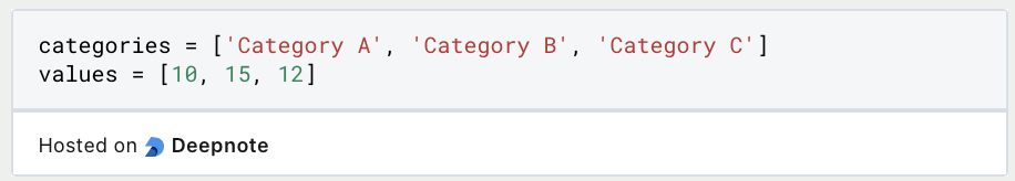
In this example, the categories list contains the labels for the x-axis, and the values list contains the corresponding numeric values for each category. Each value corresponds to the height of the bar representing that category.
For more complex bar charts, such as grouped or stacked bar charts, you may need additional sets of data to represent different groups or subcategories within each main category. These additional datasets can be used to create multiple bars or segments within each category, providing more detailed information or comparisons.
It is important to ensure that the data used for bar charts is accurate, complete, and properly formatted. Missing or incorrect data can lead to misleading or inaccurate visual representations. Additionally, consider whether the data requires any preprocessing or transformations before creating the bar chart to ensure meaningful and insightful visualizations.
By appropriately representing the data for bar charts, you can create effective visualizations that convey information clearly and help identify patterns, trends, or comparisons among different categories or groups.
What should be part of the design of bar Charts?
When creating bar charts, it is important to consider various design aspects to ensure that the visual representation effectively communicates the intended message. Here are some design considerations:
- Bar Appearance: The design of the bars themselves can impact the chart’s clarity. Consider the width and spacing of the bars to strike a balance between visibility and readability. Avoid overcrowding the chart with too many bars, as it can make the visualization cluttered and difficult to interpret.
- Color Choice: Selecting appropriate colors for the bars can enhance the visual appeal and aid in conveying information. Use colors that are visually distinct and have sufficient contrast to differentiate between the bars. It is also important to choose colors that align with the data being represented and any associated meaning or conventions.
- Axis Labels and Titles: Clear and descriptive axis labels are crucial for understanding the categories and values represented in the bar chart. Ensure that the labels are legible and properly positioned on the chart. Additionally, include a concise and informative title that summarizes the purpose or main finding of the chart.
- Data Labels: Adding data labels directly on the bars can provide specific values or percentages, aiding in precise interpretation. Data labels can be placed inside or above the bars, depending on the available space and readability. Consider the font size and formatting to ensure the labels are easily readable.
- Axis Scaling: Pay attention to the scaling of the axes to prevent distortions in the representation of data. Ensure that the axis starts from zero unless there is a specific reason to use a different starting point. Incorrect scaling can mislead viewers and distort the perception of differences between bars.
- Gridlines: Gridlines can provide additional guidance for reading the values in a bar chart. Consider adding horizontal gridlines to align with each category or value to aid in accurate interpretation. However, be cautious not to clutter the chart with excessive gridlines that can distract from the main information.
- Title and Chart Placement: When incorporating bar charts into a larger report or presentation, consider their placement and context. Provide a clear title or caption that highlights the main message or insight conveyed by the chart. Ensure that the chart is appropriately positioned within the document or slide, alongside relevant textual explanations or supporting visuals.
By carefully considering these design considerations, you can create visually appealing and informative bar charts that effectively communicate your data and insights to the audience.
How to interpret Bar Charts?
Interpreting and analyzing bar charts is essential for extracting meaningful insights from the visual representation of data. Here are key considerations for interpreting and analyzing these charts:
- Comparison: Bar charts allow for easy comparison between different categories or groups. Analyze the height or length of the bars to understand the relative magnitude of the values being represented. Compare bars within the same chart to identify patterns, trends, or disparities.
- Distribution: Examine the distribution of values across different categories. Look for variations in bar heights or lengths to identify categories that stand out or deviate from the norm. Identify whether the distribution is skewed, symmetric, or multimodal, which can provide insights into the underlying data patterns.
- Ranking: Bar charts can help rank categories based on their values. Identify the highest and lowest bars to determine the top-performing or bottom-performing categories. Consider the scale and range of the values to avoid misinterpretation, as small differences in bar heights may not necessarily indicate significant disparities.
- Trends over Time: If the bar chart represents data over time, analyze the patterns and trends in the bar heights across different time periods. Look for increasing or decreasing trends, fluctuations, or seasonal variations. Consider adding trend lines or annotations to highlight notable changes or patterns.
- Comparison with Reference Values: Use bar charts to compare values against reference points or benchmarks. This can include comparing actual values to target values, industry averages, or historical data. Analyze the differences between the bars and the reference points to identify performance gaps or achievements.
- Segmentation and Subgroups: If the data allows for it, segment the bars into subgroups or categories to gain further insights. Group bars by different variables or attributes to understand variations within each group. Compare the patterns or distributions within each subgroup to uncover differences or similarities.
- Additional Information: Consider adding additional information to enhance the interpretation of the bar chart. This can include data labels to provide specific values, annotations to highlight important observations, or tooltips for interactive charts. Use legends or color coding to represent additional dimensions or variables.
- Context and External Factors: Always consider the broader context and external factors that may influence the interpretation of the bar chart. Take into account the data source, sample size, potential biases, and any relevant external events or conditions that may impact the observed patterns or trends.
By carefully analyzing and interpreting the information presented in these charts, you can gain valuable insights into the data, uncover trends, patterns, and relationships, and effectively communicate your findings to others. Remember to consider the limitations of bar charts and supplement your analysis with additional statistical methods or visuals when necessary.
What are the limitations of this graph type?
Bar charts are a valuable tool for visualizing data, but they do have limitations that should be considered. Understanding these limitations is important for accurate and meaningful interpretation of the data. Here are the key limitations:
Bar charts are most suitable for discrete or categorical data, not continuous data. They may not effectively represent continuous or interval data, potentially leading to loss of information.
Dealing with large datasets can make bar charts cluttered and difficult to interpret. Too many bars can overwhelm the chart and make it challenging to compare values or identify patterns. Grouped or stacked charts may be better options in such cases.
Interpreting bar charts solely based on bar length can sometimes be misleading. Factors like axis scale, gaps between bars, or 3D effects can distort the perception of relative magnitudes.
These charts are primarily designed for one-dimensional data and may not effectively capture multivariate relationships. They might oversimplify the complexity of relationships between variables.
The discrete nature of bar charts may mask the underlying continuous nature of the data, potentially leading to oversimplified interpretations.
When dealing with time-series data, bar charts provide a snapshot view and may not effectively capture fine-grained temporal patterns.
The subjective selection of colors for distinguishing categories in bar charts can impact interpretation. Poor color contrast or choices can hinder readability and lead to misinterpretation.
Bar charts provide a summary view of data, potentially losing detail or precision. For high-density data or precise measurements, alternative visualizations like line charts or scatter plots may be more suitable.
Understanding these limitations helps researchers and analysts make informed decisions about using bar charts and choosing appropriate alternative visualizations. By considering the data characteristics and analysis goals, the most effective visualization method can be chosen to accurately convey insights.
What types of diagrams are used in Business Intelligence applications?
There are several types of charts used in Business Intelligence (BI) to represent data and help users visualize and analyze information. Here are some of the most common chart types:
- Bar charts: Bar charts are used to compare data across categories or groups and are one of the most common chart types in BI. While they are very similar to histograms, they should not be confused.
- Histograms: A histogram is a visualization form from the field of statistics that is used to illustrate frequency distributions. It involves counting the data points that fall into a defined group and then displaying their values in individual bars.
- Line charts: Line charts are used to show trends over time and are useful for visualizing changes in data over a period of time.
- Scatter plots: Scatter plots are used to show the relationship between two variables and are commonly used in BI to identify patterns and correlations.
- Heat maps: heat maps are used to represent data in color and are useful for highlighting patterns and trends in large data sets.
- Tree charts: used to represent hierarchical data, tree charts are used in BI to show the size and composition of different categories of data.
- Pie charts: Pie charts are used to show the composition of data and are suitable for showing proportions and percentages.
- Sankey charts: Sankey diagrams are used to visualize the flow of data or processes and are useful for understanding complex systems and processes.
- Bubble charts: Used to show the relationship between three variables, bubble charts are often used in BI to identify patterns and correlations.
These are just a few examples of the many types of charts used in business intelligence.
This is what you should take with you
- Bar charts are a popular and effective visualization tool for displaying categorical or discrete data.
- They provide a clear and intuitive representation of data, allowing for easy comparison and identification of patterns.
- Bar charts offer flexibility in terms of design and customization options, such as color choices and bar orientation.
- By understanding the limitations of bar charts, such as their suitability for continuous data or potential issues with cluttering, researchers can make informed decisions about when to use them and when to consider alternative visualizations.
- Overall, bar charts are a valuable tool for data analysis and communication, enabling clear and concise representation of information.

What is the Univariate Analysis?
Master Univariate Analysis: Dive Deep into Data with Visualization, and Python - Learn from In-Depth Examples and Hands-On Code.

What is OpenAPI?
Explore OpenAPI: A Comprehensive Guide to Building and Consuming RESTful APIs. Learn How to Design, Document, and Test APIs.

What is Data Governance?
Ensure the quality, availability, and integrity of your organization's data through effective data governance. Learn more here.

What is Data Quality?
Ensuring Data Quality: Importance, Challenges, and Best Practices. Learn how to maintain high-quality data to drive better business decisions.

What is Data Imputation?
Impute missing values with data imputation techniques. Optimize data quality and learn more about the techniques and importance.
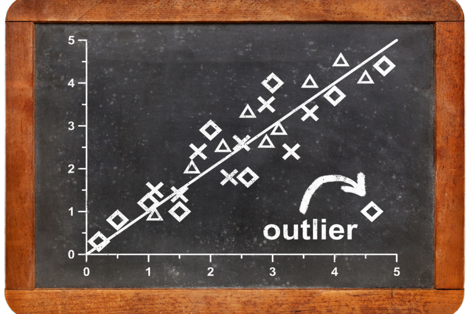
What is Outlier Detection?
Discover hidden anomalies in your data with advanced outlier detection techniques. Improve decision-making and uncover valuable insights.
Other Articles on the Topic of Bar Charts
You can find an interesting article on how to do bar charts in Matplotlib here.

Niklas Lang
I have been working as a machine learning engineer and software developer since 2020 and am passionate about the world of data, algorithms and software development. In addition to my work in the field, I teach at several German universities, including the IU International University of Applied Sciences and the Baden-Württemberg Cooperative State University, in the fields of data science, mathematics and business analytics.
My goal is to present complex topics such as statistics and machine learning in a way that makes them not only understandable, but also exciting and tangible. I combine practical experience from industry with sound theoretical foundations to prepare my students in the best possible way for the challenges of the data world.