In the realm of data analysis, understanding the relationships between variables is often the key to unraveling valuable insights. Welcome to the world of bivariate analysis, where the focus shifts from individual variables to the dynamic interplay between pairs of them. This analytical technique is a cornerstone of statistical inquiry, allowing us to dig deeper into data, draw connections, and make informed decisions.
Imagine you’re investigating the impact of advertising spending on product sales or exploring how student performance relates to study hours. Bivariate analysis is your trusty compass, guiding you through the intricate terrain of associations, dependencies, and correlations.
In this article, we embark on a journey into the heart of bivariate analysis. We’ll delve into its fundamental concepts, practical methodologies, and real-world applications. Whether you’re a data enthusiast, a researcher, or a business professional seeking to uncover the secrets hidden within your datasets, join us as we navigate the world of bivariate analysis and harness the power of two variables working in concert.
What is Bivariate Analysis?
Bivariate analysis is a statistical method used in data analysis and research to examine the relationship between two variables. Unlike univariate analysis, which focuses on a single variable at a time, bivariate analysis explores how two different variables interact or influence each other.
At its core, bivariate analysis seeks to answer questions such as:
- Does a change in one variable correspond to a change in another variable?
- Are the two variables related in some way?
- Can one variable be predicted or explained based on the values of the other variable?
This analytical approach is particularly valuable in various fields, including economics, social sciences, healthcare, and marketing, where understanding the connections between variables is crucial for making informed decisions.
Bivariate analysis can take on many forms, depending on the types of variables being studied. Some common scenarios include:
- Continuous vs. Continuous: When both variables under investigation are continuous (numeric), researchers often use techniques such as correlation analysis or scatterplots to visualize and measure the strength and direction of the relationship.
- Categorical vs. Categorical: In cases where both variables are categorical (non-numeric), methods like chi-square tests of independence help determine if there is a significant association between the two variables.
- Continuous vs. Categorical: When one variable is continuous and the other is categorical, techniques like t-tests or analysis of variance (ANOVA) are employed to compare means across different categories or groups.
- Time-Series Bivariate Analysis: In time-series data, researchers may investigate how changes in one variable impact another variable over time. This can involve techniques like cross-correlation or Granger causality tests.
Bivariate analysis serves as a fundamental building block for more complex multivariate analyses and modeling. It allows researchers and analysts to gain valuable insights into the dependencies and interactions between variables, paving the way for better-informed decision-making and a deeper understanding of underlying patterns in data.
What are the different types of Bivariate Analysis?
Bivariate analysis encompasses a variety of techniques, each designed to explore the relationship between two different variables. The choice of which method to use depends on the types of variables you are working with and the research questions you aim to answer. Here are some common types of bivariate analysis:
- Correlation Analysis: This is one of the most widely used techniques for examining the relationship between two continuous variables. The Pearson correlation coefficient measures the strength and direction of a linear relationship. A value close to 1 indicates a strong positive correlation, close to -1 suggests a strong negative correlation, and close to 0 implies little to no correlation.
- Scatterplots: Scatterplots are graphical representations of data points in a two-dimensional space. They are particularly useful for visualizing the relationship between two continuous variables. The pattern of points on the scatterplot can provide insights into the nature of the relationship.
- Covariance: Covariance is a statistical measure that assesses how two continuous variables change together. It indicates the direction of the linear relationship (positive or negative) but doesn’t provide a standardized measure like correlation coefficients.
- Chi-Square Test: When dealing with two categorical variables, the chi-square test of independence is a common choice. It helps determine whether there is a significant association between the two variables. For example, it can be used to analyze whether there’s a relationship between gender and voting preferences.
- T-Test: The t-test is used when you want to compare the means of two groups for a continuous variable. For instance, you might use a t-test to determine if there’s a significant difference in the test scores of two different teaching methods.
- Analysis of Variance (ANOVA): ANOVA is an extension of the t-test and is used when there are more than two groups to compare. It assesses whether there are statistically significant differences among the means of three or more groups.
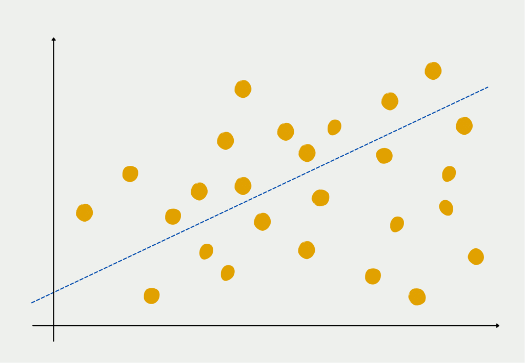
- Regression Analysis: Bivariate regression analysis is used to model and predict the relationship between one dependent variable and one independent variable. For example, you might use simple linear regression to predict how changes in temperature (independent variable) affect ice cream sales (dependent variable).
- Logistic Regression: This technique is suitable when the outcome variable is binary (e.g., yes/no, success/failure). Logistic regression helps understand the relationship between one or more predictor variables and the probability of the binary outcome.
- Spearman’s Rank-Order Correlation: When dealing with ordinal or non-normally distributed continuous variables, Spearman’s correlation provides a non-parametric measure of association. It’s based on the rank order of data points rather than their actual values.
These are just a few examples of the many bivariate analysis techniques available. The choice of method depends on your data types, research objectives, and the assumptions you are willing to make about your data. Properly executed bivariate analysis can provide valuable insights into the relationships between variables, informing decision-making and guiding further research.
What are Scatterplots and Scatterdiagrams?
In the realm of bivariate analysis, scatterplots, and scatter diagrams are indispensable tools for visually exploring and understanding the relationship between two continuous variables. These graphical representations offer valuable insights into patterns, trends, and potential associations within your data.
What is a Scatterplot?
A scatterplot, also known as a scatter diagram or scatter graph, is a two-dimensional graphical representation of data points. In bivariate analysis, it displays each data point as a dot on a Cartesian plane, with one variable plotted on the x-axis (horizontal) and the other on the y-axis (vertical).
How to Create a Scatterplot:
Creating a scatterplot is straightforward:
- Data Preparation: Ensure you have a dataset containing two continuous variables that you want to analyze together.
- Choose Axes: Select which variable will go on the x-axis and which on the y-axis, depending on your research question and the variables’ roles.
- Plot Data Points: For each data point, find the corresponding values of the two variables and place a dot at the intersection of the corresponding x and y values.
- Label Axes: Label the x-axis and y-axis to indicate the variables being represented.
Interpreting a Scatterplot:
Interpreting a scatterplot involves examining the pattern of dots and identifying trends:
- Direction: Look at the general direction of the dots. Are they sloping upwards from left to right, indicating a positive correlation? Or are they sloping downwards, suggesting a negative correlation?
- Strength: Assess the degree of scatter or clustering of the dots. A tight cluster indicates a strong correlation, while a scattered pattern suggests a weak correlation.
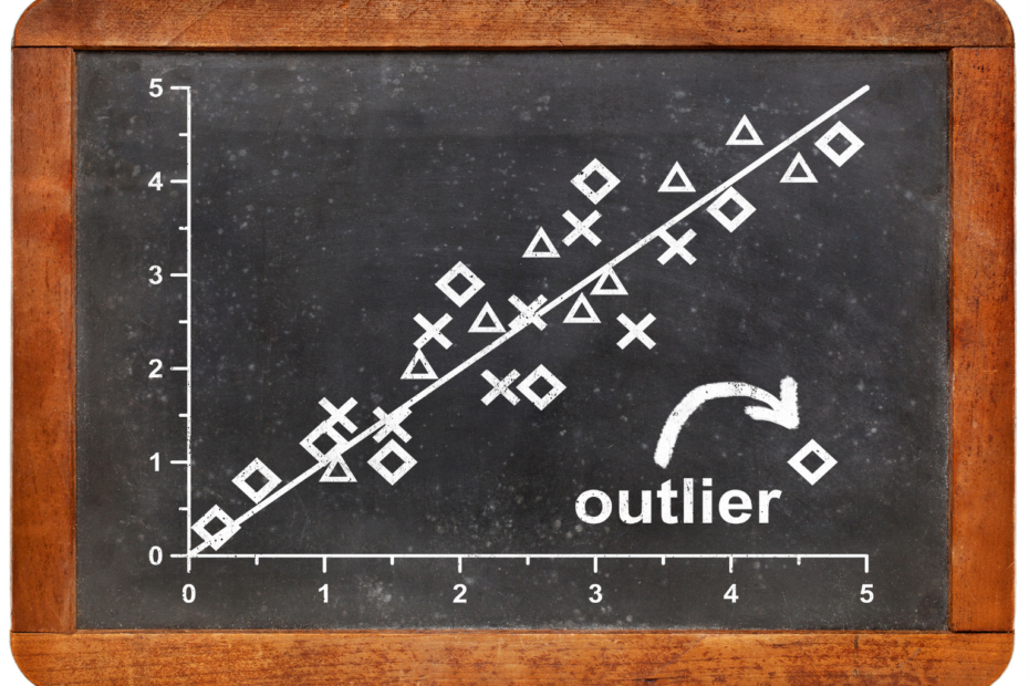
- Outliers: Identify any data points that lie far from the main cluster of dots. Outliers can be influential in the analysis and may require further investigation.
- Linearity: Consider whether the data points form a linear pattern. If so, a linear relationship may exist between the two variables. If not, the relationship may be nonlinear.
Use Cases of Scatterplots in Bivariate Analysis:
- Correlation Assessment: Scatterplots are often used to assess the strength and direction of the relationship between two continuous variables. A strong positive correlation appears as a tight cluster of dots sloping upwards, while a strong negative correlation appears as a tight cluster sloping downwards.
- Outlier Detection: Outliers, which are data points significantly different from the others, can be easily spotted on a scatterplot. Their presence may indicate data quality issues or unique observations requiring special attention.
- Pattern Recognition: Scatterplots help recognize patterns, such as seasonality in time-series data, cyclic behavior, or linear trends. These patterns can inform decision-making and guide further analysis.
- Heteroscedasticity Detection: In regression analysis, scatterplots can reveal heteroscedasticity, which is a situation where the spread of data points varies systematically with the independent variable. This information is crucial for model selection and interpretation.
In summary, scatterplots and scatter diagrams play a pivotal role in bivariate analysis by providing a visual means to explore and interpret the relationship between two continuous variables. These visualizations serve as a foundation for more advanced statistical analyses and guide decision-making processes in various fields, from economics and finance to healthcare and environmental science.
What is the Correlation Analysis?
Correlation analysis is a fundamental component of bivariate analysis, aimed at quantifying and understanding the strength and direction of the relationship between two continuous variables. It provides valuable insights into how changes in one variable may be associated with changes in another.
What is Correlation Analysis?
Correlation analysis involves calculating a correlation coefficient, typically Pearson’s correlation coefficient (often denoted as “r”), to quantify the linear relationship between two variables. This coefficient provides information about the following aspects of the relationship:
- Strength: The magnitude of the correlation coefficient indicates how strong the relationship is. A coefficient close to 1 signifies a strong positive correlation, while a coefficient close to -1 indicates a strong negative correlation. A coefficient near 0 suggests a weak or no linear correlation.
- Direction: The sign of the correlation coefficient (+ or -) reveals the direction of the relationship. A positive coefficient indicates a positive correlation, meaning that as one variable increases, the other tends to increase as well. Conversely, a negative coefficient signifies a negative correlation, where one variable tends to decrease as the other increases.
Interpreting Correlation Coefficients:
The correlation coefficient ranges from -1 to 1:
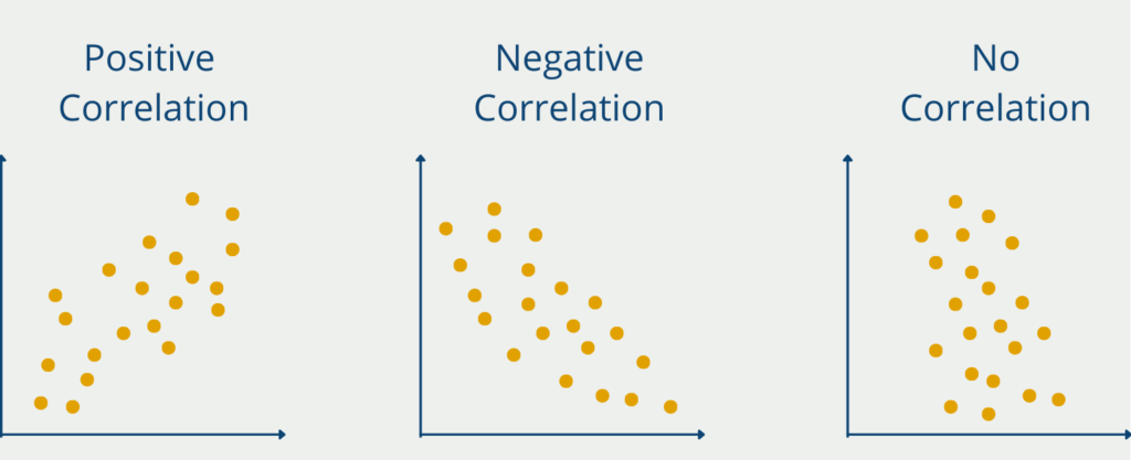
- Positive Correlation (r > 0): When “r” is greater than 0, it suggests that as one variable increases, the other tends to increase as well. The closer “r” is to 1, the stronger the positive correlation.
- Negative Correlation (r < 0): A correlation coefficient less than 0 implies that as one variable increases, the other tends to decrease. The closer “r” is to -1, the stronger the negative correlation.
- No Correlation (r = 0): When the correlation coefficient is close to 0, it indicates little to no linear relationship between the variables.

Creating a Scatterplot for Correlation Visualization:
Before calculating the correlation coefficient, it’s common to create a scatterplot to visualize the relationship between the two variables. Scatterplots help you assess the linearity of the relationship, detect outliers, and identify patterns.
Use Cases of Correlation Analysis in Bivariate Analysis:
- Strength of Association: Correlation analysis is used to determine the strength of the relationship between variables. For example, in finance, it can quantify the relationship between interest rates and stock market returns.
- Model Building: In predictive modeling, understanding the correlations between variables helps select relevant predictors for a model. Highly correlated variables may be redundant.
- Quality Control: In manufacturing, correlation analysis can identify variables that are strongly related, which may indicate a quality control issue that needs attention.
- Healthcare: In medical research, correlation analysis can be used to assess the relationship between factors like diet and health outcomes.
- Social Sciences: In sociology or psychology, correlation analysis can explore connections between variables like income and happiness.
- Environmental Studies: Correlation analysis can reveal links between environmental factors like pollution levels and public health.
It’s important to note that correlation does not imply causation. While a correlation suggests an association between two variables, it does not prove that changes in one variable cause changes in the other. Establishing causation often requires additional research and experimentation.
In summary, correlation analysis is a powerful tool in bivariate analysis for quantifying and interpreting the relationship between two continuous variables. It provides valuable insights into how variables are related, which is essential for making informed decisions in various fields of study and industry sectors.
What is Regression Analysis?
Regression analysis is a statistical technique employed in bivariate analysis to examine the relationship between two continuous variables. Unlike correlation analysis, which quantifies the strength and direction of a relationship, regression analysis goes a step further by modeling the relationship and making predictions based on that model.
What is Regression Analysis?
Regression analysis involves fitting a mathematical model to the data to describe how one variable (the dependent or response variable) changes in relation to changes in another variable (the independent or predictor variable). The goal is to find the best-fitting model that explains the relationship between the two variables.

Key Elements of Regression Analysis:
- Dependent Variable: The variable that you want to predict or explain is known as the dependent variable (Y). It’s the outcome variable or what you’re trying to understand.
- Independent Variable: The variable that you believe influences or explains changes in the dependent variable is the independent variable (X). It’s the predictor variable.
- Regression Model: The regression model is a mathematical equation that represents the relationship between the dependent and independent variables. The simplest form is the linear regression model, which assumes a linear relationship between the variables:
\(\) \[ y = \beta_{0} + \beta_{1} \cdot X + \epsilon \]
- Y is the dependent variable.
- X is the independent variable.
- β₀ is the intercept (the value of Y when X is 0).
- β₁ is the slope (how much Y changes for a one-unit change in X).
- ε represents the error term (unexplained variability).
β₀ and β₁ are the parameters of the regression model. They are estimated from the data to find the best-fit line that minimizes the sum of squared errors (the differences between the observed and predicted values).
Interpreting Regression Analysis:
Regression analysis provides insights into the following aspects of the relationship between variables:
- Strength and Significance: The coefficient β₁ indicates the strength and direction of the relationship. A positive β₁ suggests that as X increases, Y tends to increase, while a negative β₁ implies the opposite. The magnitude of β₁ reflects the degree of impact.
- Prediction: Regression analysis allows you to predict the value of the dependent variable for a given value of the independent variable. This predictive capability is valuable in various fields, such as finance (predicting stock prices), economics (predicting inflation rates), and healthcare (predicting patient outcomes).
Use Cases of Regression Analysis in Bivariate Analysis:
- Economics: Predicting the relationship between factors like income and spending or employment rates and economic growth.
- Healthcare: Modeling the impact of variables like diet and exercise on health outcomes, such as weight loss or blood pressure.
- Marketing: Analyzing the influence of advertising spending on product sales.
- Environmental Science: Understanding the relationship between pollution levels and biodiversity.
- Engineering: Predicting the relationship between variables like temperature and material strength.
It’s important to conduct regression analysis with caution and consider potential limitations. Correlation does not imply causation, and regression results should not be interpreted as causal relationships without further evidence. Additionally, the assumptions of the regression model, such as linearity and homoscedasticity, should be assessed.
In summary, regression analysis is a powerful tool in bivariate analysis that goes beyond correlation by modeling and predicting the relationship between two continuous variables. It is widely used in various fields to understand, explain, and make predictions based on data.
This is what you should take with you
- Bivariate analysis is a fundamental statistical technique that uncovers relationships and associations between two variables.
- Through correlation analysis, we can quantify the strength and direction of relationships. Positive, negative, or no correlation provides valuable insights.
- Scatterplots are a powerful tool for visualizing bivariate data. They allow us to identify patterns and trends by plotting data points on a graph.
- Regression analysis takes bivariate analysis to the next level by modeling the relationship and making predictions. It’s a versatile technique used in various fields.
- Bivariate analysis has applications in economics, healthcare, marketing, environmental science, engineering, and more.
- While bivariate analysis is valuable, it doesn’t imply causation. It’s crucial to interpret results cautiously and consider underlying assumptions.
- Bivariate analysis empowers data-driven decision-making by providing insights into how two variables are related, which is essential for understanding complex systems and making informed choices.
- Bivariate analysis serves as a foundation for more advanced multivariate analysis, where relationships among multiple variables are explored.
What is the Univariate Analysis?
Master Univariate Analysis: Dive Deep into Data with Visualization, and Python - Learn from In-Depth Examples and Hands-On Code.
What is OpenAPI?
Explore OpenAPI: A Comprehensive Guide to Building and Consuming RESTful APIs. Learn How to Design, Document, and Test APIs.
What is Data Governance?
Ensure the quality, availability, and integrity of your organization's data through effective data governance. Learn more here.
What is Data Quality?
Ensuring Data Quality: Importance, Challenges, and Best Practices. Learn how to maintain high-quality data to drive better business decisions.
What is Data Imputation?
Impute missing values with data imputation techniques. Optimize data quality and learn more about the techniques and importance.
What is Outlier Detection?
Discover hidden anomalies in your data with advanced outlier detection techniques. Improve decision-making and uncover valuable insights.
Other Articles on the Topic of Bivariate Analysis
The University of West Georgia has an interesting article on the topic of Bivariate Analysis that you can find here.

Niklas Lang
I have been working as a machine learning engineer and software developer since 2020 and am passionate about the world of data, algorithms and software development. In addition to my work in the field, I teach at several German universities, including the IU International University of Applied Sciences and the Baden-Württemberg Cooperative State University, in the fields of data science, mathematics and business analytics.
My goal is to present complex topics such as statistics and machine learning in a way that makes them not only understandable, but also exciting and tangible. I combine practical experience from industry with sound theoretical foundations to prepare my students in the best possible way for the challenges of the data world.


