In the realm of data analysis and visualization, presenting information in a visually appealing and informative manner is crucial. Enter Seaborn, a powerful Python library built on top of Matplotlib. With its elegant aesthetics and intuitive functionality, the library has gained popularity among data enthusiasts and professionals alike. In this article, we delve into the world of Seaborn, exploring its features, capabilities, and practical applications.
Whether you are a data scientist, analyst, or enthusiast, join us on this journey to uncover the secrets of Seaborn and unlock a new level of data visualization prowess. Get ready to bring your visualizations to life with the library’s simplicity, versatility, and captivating appeal.
What is Seaborn?
Seaborn is a Python data visualization library that builds on top of Matplotlib, another popular visualization library. It provides a high-level interface for creating aesthetically pleasing and informative statistical graphics. It acts as a complement to Matplotlib, offering a simplified approach to complex visualizations with fewer lines of code.
One of the key advantages of Seaborn is its ability to create visually appealing plots effortlessly. It offers a wide range of pre-defined color palettes and themes, making it easy to customize the look and feel of your visualizations. It also provides several built-in plot types that are particularly useful for exploring relationships in datasets and performing statistical analysis.
Seaborn excels in visualizing categorical and numerical data, providing specialized plot types for each. It offers functions for creating scatter plots, line plots, bar plots, histograms, box plots, violin plots, and more. These plots can be further enhanced with additional statistical information, such as regression lines or confidence intervals, allowing for a comprehensive analysis of the data.
Moreover, the library integrates seamlessly with popular data manipulation libraries like Pandas and NumPy, enabling users to easily incorporate data preprocessing and analysis into their visualization workflows. This integration streamlines the process of creating visualizations from data stored in these formats.
In summary, Seaborn simplifies the process of creating stunning and meaningful visualizations in Python. Its user-friendly interface, extensive customization options, and statistical capabilities make it a valuable tool for data exploration, analysis, and communication. Whether you are a beginner or an experienced data scientist, this library empowers you to bring your data to life and uncover valuable insights through visually compelling plots.
How do you install Seaborn in Python?
Installing the library and its dependencies in Python is a straightforward process. Here’s a step-by-step guide to help you get started:
- Set up a Python Environment: Ensure that you have Python installed on your system. You can download the latest version of Python from the official Python website (python.org) and follow the installation instructions specific to your operating system.
- Install Required Libraries: Seaborn relies on several dependencies, including Matplotlib, NumPy, and Pandas. You can install these libraries using the Python package manager, pip. Open your terminal or command prompt and execute the following command:
This command will install Matplotlib, NumPy, and Pandas on your system.
- Install Seaborn: Once the dependencies are installed, you can proceed to install the library itself. In your terminal or command prompt, execute the following command:

This command will download and install the latest version.
- Verify the Installation: To ensure that Seaborn and its dependencies are installed correctly, you can verify the installation by running a simple test script. Open a Python interpreter or create a new Python script and import it using the abbreviation “sns” for further references:
If there are no error messages, the installation was successful.
Congratulations! You have successfully installed Seaborn and its dependencies. You are now ready to start creating beautiful and insightful visualizations. Remember to refer to the documentation for further guidance and explore the wide range of possibilities offered by this powerful data visualization library.
How can you create basic plots in Seaborn?
Creating basic plots in Seaborn is a breeze. With its intuitive API and built-in plot types, you can quickly generate visually appealing visualizations.
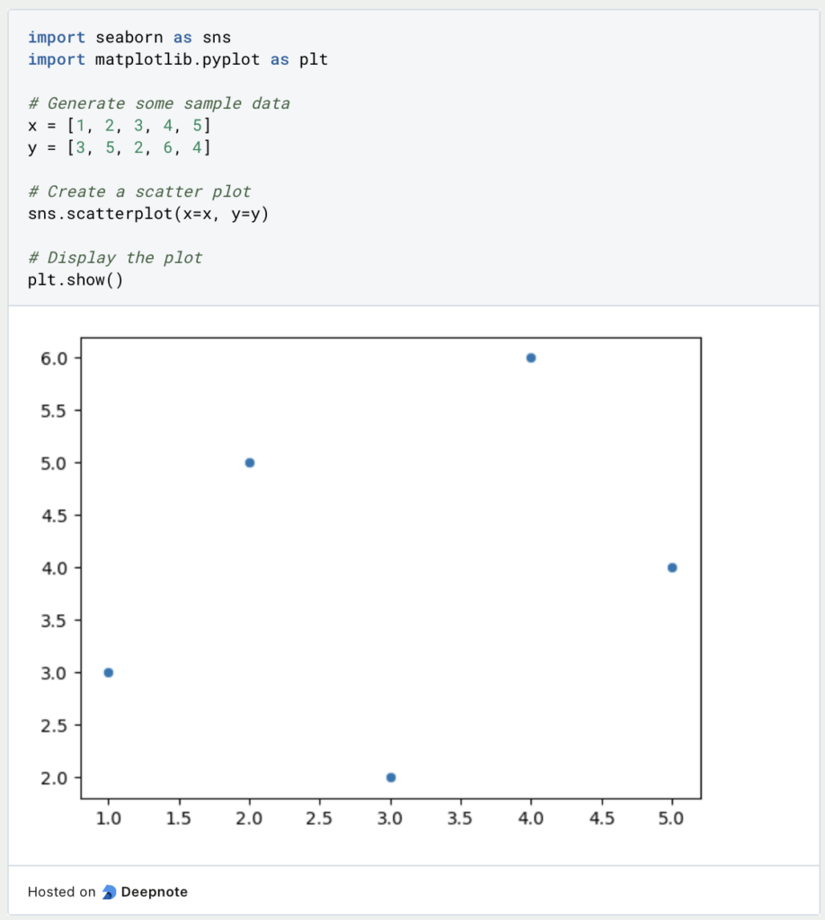
- Scatter Plots: Scatter plots are ideal for visualizing the relationship between two continuous variables. The
scatterplot()function makes it easy to create scatter plots.
- Line Plots: Line plots are useful for visualizing the trend or change in a variable over continuous intervals. The
lineplot()function can be used to create line plots.

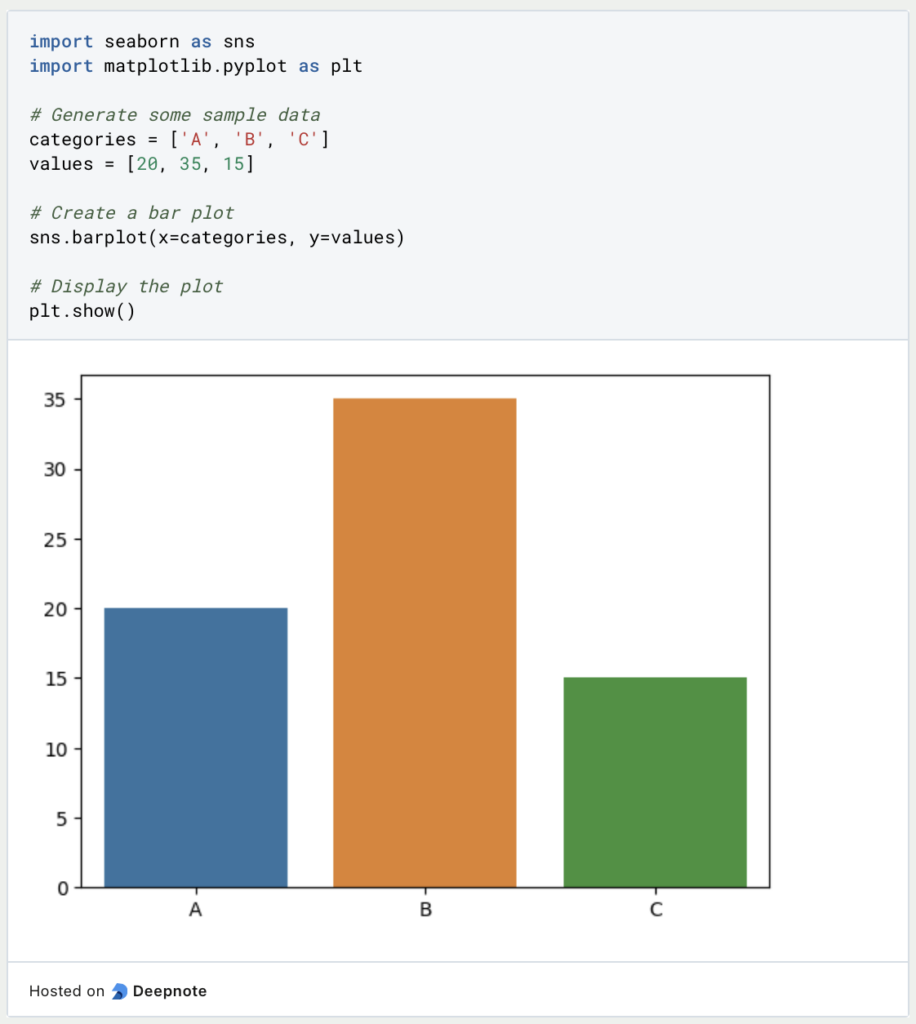
- Bar Plots: Bar plots are great for comparing categorical variables or displaying frequencies. The
barplot()function allows you to create bar plots easily.
These are just a few examples of basic plots you can create with Seaborn. The library offers many more plot types and customization options to explore. Refer to the documentation and example gallery for more detailed guidance and inspiration. Experiment with different plot types, customize the aesthetics and unleash the power of the visualization library to bring your data to life with visually stunning plots.
What are advanced visualization techniques used in Seaborn?
Seaborn, being a versatile data visualization library, offers advanced techniques to create insightful and visually captivating visualizations. Let’s explore some of these techniques that can take your data analysis and visualization to the next level:
- Faceting: Seaborn allows you to create small multiples or “facets” of your data by dividing the plot into multiple panels based on a categorical variable. This technique helps in comparing patterns and relationships across different subgroups. You can use the
FacetGridclass to achieve this.

- Pair Plots: Pair plots are a powerful way to visualize relationships between multiple variables in a dataset. The
pairplot()function creates a grid of scatter plots, displaying the pairwise relationships. This technique is particularly useful for exploring correlations and patterns in multivariate datasets.

- Heatmaps: Heatmaps are effective for visualizing matrices or 2D data with color-encoded values. The
heatmap()function allows you to create heat maps with ease. This technique is useful for displaying correlations, confusion matrices, or any form of data that can be represented in a grid format.

- Violin Plots: Violin plots are useful for visualizing the distribution of a continuous variable across different categories. The
violinplot()function creates violin plots, providing insights into the data’s density, symmetry, and outliers. This technique is particularly effective for comparing distributions and understanding data variability.

These advanced visualization techniques in Seaborn are just a glimpse of the library’s capabilities. Seaborn offers many more plot types, customization options, and statistical functionalities to explore. With its intuitive interface and powerful features, Seaborn empowers you to create sophisticated and informative visualizations to gain deeper insights from your data.
How can you use Seaborn with Pandas and NumPy?
Seaborn, when used in conjunction with NumPy and Pandas, becomes an even more powerful tool for data analysis and visualization. Let’s explore how you can leverage the integration to enhance your data workflows:
- NumPy Integration: NumPy provides support for efficient numerical operations and array manipulations. Seaborn seamlessly integrates with NumPy, allowing you to leverage NumPy arrays within your plots. You can convert NumPy arrays to Pandas DataFrames or directly use them in Seaborn functions.

- Pandas Integration: Pandas is a powerful library for data manipulation and analysis. Seaborn complements Pandas by providing visually appealing and informative visualizations. You can directly pass Pandas DataFrames to create insightful plots.

Additionally, Seaborn integrates well with Pandas’ DataFrame functionality, making it easy to perform groupings, aggregations, and transformations on your data before visualizing it. You can leverage Pandas’ capabilities to preprocess your data and create meaningful visualizations.
- Data Exploration: Together, Seaborn, NumPy, and Pandas provide a powerful toolkit for data exploration. You can use Pandas to load, clean, and manipulate your data, NumPy to perform numerical computations, and Seaborn to visualize patterns and relationships in the data. By combining these libraries, you can efficiently analyze your datasets and gain insights through visual representations.

The integration between Seaborn, NumPy, and Pandas empowers you to seamlessly transition between data manipulation, analysis, and visualization. This integration facilitates a streamlined workflow, allowing you to focus on gaining insights and effectively communicating your findings through visually appealing plots.
How does Seaborn compare to other visualization libraries?
Seaborn, as a data visualization library in Python, offers several advantages compared to other visualization libraries. Let’s explore how it compares to other popular visualization libraries in Python:
- Matplotlib: Seaborn builds on top of Matplotlib, enhancing its functionality and providing a higher-level API for creating visually appealing plots. While Matplotlib offers great flexibility and customization options, Seaborn simplifies the process of creating complex statistical plots by providing optimized defaults and specialized plot types. Its integration with Pandas makes it particularly convenient for working with structured data.
- Plotly: Seaborn and Plotly serve different purposes in the Python visualization ecosystem. Seaborn focuses on static, high-level statistical visualizations, while Plotly specializes in interactive and web-based visualizations. Plotly offers features like interactivity, zooming, and tooltips, making it suitable for creating interactive dashboards and data exploration applications. Seaborn, on the other hand, excels in creating static, publication-quality plots with less code.
- Bokeh: Bokeh is another library that emphasizes interactive visualizations, particularly for web-based applications. It offers powerful tools for creating interactive plots with a focus on interactivity and user interaction. While Seaborn is primarily used for static visualizations, Bokeh allows for a more interactive exploration of data. However, Seaborn’s simplicity and optimized defaults make it a preferred choice for quickly creating informative statistical plots.
- ggplot (ggplot2): Seaborn draws inspiration from the popular R library ggplot2, which follows the grammar of graphics principles. Both libraries provide a high-level interface for creating visually appealing statistical graphics. However, Seaborn is specifically designed for Python and integrates seamlessly with other Python libraries like Pandas and NumPy. Its API is more Pythonic, making it feel natural for Python users.
In summary, Seaborn stands out for its simplicity, optimized defaults, and specialized statistical plot types. Its integration with Pandas and NumPy streamlines the process of working with structured data. While other libraries like Matplotlib, Plotly, Bokeh, and ggplot offer their own unique strengths and functionalities, Seaborn’s focus on statistical visualizations and ease of use make it a popular choice for quickly generating informative plots in Python. Depending on your specific requirements, you can choose the library that best fits your needs and workflow.
This is what you should take with you
- Simplified syntax and optimized defaults for creating visually appealing plots quickly.
- Integration with Pandas and NumPy, making it convenient for working with structured data.
- Specialized statistical plot types that enable the exploration and communication of complex relationships in the data.
- Seamless integration with Matplotlib, leveraging its flexibility and customization options.
- Complementary use with other libraries like Plotly, Bokeh, and ggplot for interactive and web-based visualizations.
- Inspired by the grammar of graphics principles, providing a high-level interface for Python users.
- The ability to create static, publication-quality plots with minimal code.
- Extensive documentation and a rich example gallery for learning and inspiration.
- Regular updates and maintenance from an active development community.

What are Python Variables?
Dive into Python Variables: Explore data storage, dynamic typing, scoping, and best practices for efficient and readable code.
What is Jenkins?
Mastering Jenkins: Streamline DevOps with Powerful Automation. Learn CI/CD Concepts & Boost Software Delivery.

What are Conditional Statements in Python?
Learn how to use conditional statements in Python. Understand if-else, nested if, and elif statements for efficient programming.

What is XOR?
Explore XOR: The Exclusive OR operator's role in logic, encryption, math, AI, and technology.

How can you do Python Exception Handling?
Unlocking the Art of Python Exception Handling: Best Practices, Tips, and Key Differences Between Python 2 and Python 3.

What are Python Modules?
Explore Python modules: understand their role, enhance functionality, and streamline coding in diverse applications.
Other Articles on the Topic of Seaborn
You can find the official website here.

Niklas Lang
I have been working as a machine learning engineer and software developer since 2020 and am passionate about the world of data, algorithms and software development. In addition to my work in the field, I teach at several German universities, including the IU International University of Applied Sciences and the Baden-Württemberg Cooperative State University, in the fields of data science, mathematics and business analytics.
My goal is to present complex topics such as statistics and machine learning in a way that makes them not only understandable, but also exciting and tangible. I combine practical experience from industry with sound theoretical foundations to prepare my students in the best possible way for the challenges of the data world.