Line charts are a fundamental and widely used tool for visualizing data. They provide a clear and intuitive way to represent the relationship between two continuous variables over a specific period or range. Whether you’re analyzing stock market trends, tracking temperature variations, or monitoring sales performance, line charts offer valuable insights into the patterns and trends hidden within your data.
In this article, we will explore the world of line charts, discussing their key components, creation techniques, customization options, and interpretation strategies. We will delve into the art of presenting data effectively using line charts, guiding you through best practices and sharing real-world examples. By the end, you will have a solid understanding of how to harness the power of line charts to uncover valuable insights and communicate your findings with clarity. So, let’s dive in and unlock the potential of these charts in your data visualization journey.
What are the key components of a line chart?
Line charts are composed of several key components that work together to convey information effectively. Understanding these components will enable you to interpret them accurately and make informed decisions based on the insights they provide. Let’s explore the essential elements of a line chart:
- X-Axis and Y-Axis: The X-axis represents the independent variable, typically a time period or a continuous numerical scale. The Y-axis represents the dependent variable, which is the data being measured or observed. The X and Y-axes provide the foundation for plotting the data points.
- Data Points: Data points are represented by markers or dots on the chart, indicating the value of the dependent variable corresponding to a specific point on the X-axis. Each data point represents an individual observation or measurement in the dataset.
- Line: The line connects the data points, creating a visual representation of the relationship between the two variables. It helps identify trends, patterns, and changes in the data over time or along the X-axis.
- Title and Labels: A line chart should have a clear and descriptive title that reflects the purpose or subject of the chart. Additionally, the X and Y-axes should be labeled to indicate the variables being represented. These labels provide context and help users understand the meaning of the data.
- Legend: If the line chart includes multiple lines or series, a legend is used to differentiate and label each series. The legend provides a key that maps the colors or symbols used in the chart to the corresponding data series.
- Gridlines: Gridlines are horizontal and vertical lines that intersect at regular intervals across the chart area. They help align the data points and make it easier to read and interpret the values along the axes.
- Scale and Units: The scale of the chart determines the range and increments of the values displayed on the axes. It is essential to choose appropriate scales and units that accurately represent the data and facilitate meaningful comparisons.
Understanding these key components will enhance your ability to interpret line charts effectively. By examining the data points, following the trend lines, and analyzing the scale and labels, you can uncover valuable insights and make informed decisions based on the patterns and trends revealed by the line chart.
Why is Data Preparation important for Line Charts?
Data preparation is a crucial step in creating meaningful and accurate line charts. It involves several key components that are essential for producing effective visualizations. Proper data preparation ensures that the charts convey the intended information accurately and enable insightful interpretations.
One critical aspect of data preparation is data accuracy. It involves thoroughly examining and cleansing the data to identify and address errors, inconsistencies, missing values, and outliers. By ensuring the integrity of the data, we can trust that the resulting line chart accurately represents the underlying information.
Another important consideration is data formatting. Line charts require structured data with clear labels for the independent and dependent variables. Proper data formatting ensures that the chart is easy to understand and interpret.
Handling missing data is also a vital part of data preparation. Real-world datasets often have missing values, and addressing them is crucial. This involves employing appropriate imputation methods or excluding incomplete records, ensuring that the line chart provides a comprehensive view of the available data.
Time alignment is particularly relevant for these chart types depicting data over time. Proper time alignment involves sorting the data chronologically and maintaining consistent time intervals between data points. This ensures accurate representation of temporal patterns and trends.
Data scaling and normalization are important when line charts involve multiple series or variables with varying scales or units. Scaling or normalizing the data facilitates fair comparisons and prevents one series from dominating the chart. Techniques like min-max scaling or z-score normalization standardize the data for visual comparability.
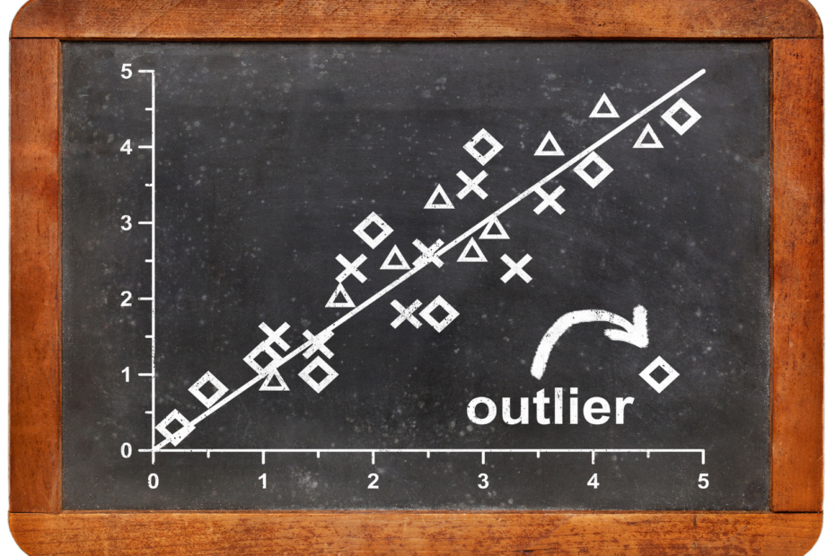
Handling outliers is another critical aspect of data preparation. Outliers can significantly impact the interpretation of line charts. Identifying and appropriately addressing outliers ensures that the chart accurately reflects overall trends and patterns.
Data aggregation may be necessary depending on the granularity of the data and the chart’s purpose. Aggregating data into meaningful intervals or summarizing it at specific time points simplifies the chart and highlights key trends or patterns.
Investing time and effort in data preparation is crucial for creating line charts that provide clear, accurate, and meaningful representations of the underlying information. Proper data preparation enhances the reliability and credibility of insights derived from line charts, enabling effective decision-making and communication of data-driven findings.
How to create Line Charts in Python?
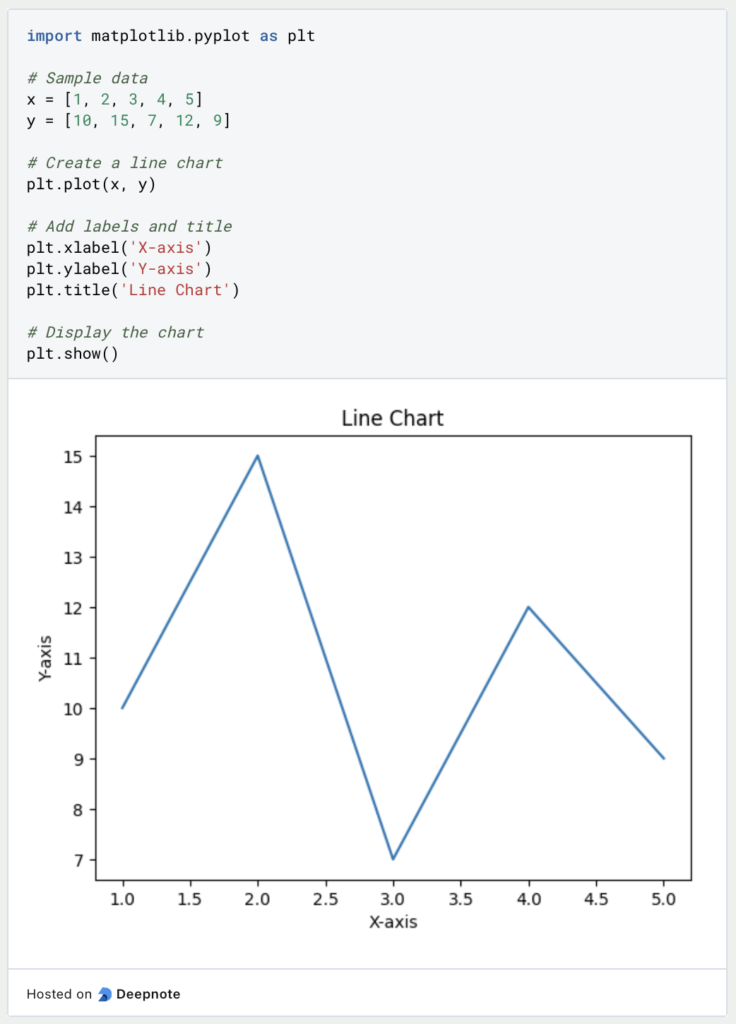
In Python, we have access to various libraries that make it easy to create line charts and visualize data. Two popular libraries for creating these charts are Matplotlib and Seaborn. Let’s explore how to create these charts using these libraries with some code snippets.
Using Matplotlib:
Using Seaborn:

These examples demonstrate the basic process of creating a line chart using Matplotlib and Seaborn. By providing the x and y data points, you can generate a chart. Additional customizations, such as adding labels and a title, help enhance the chart’s clarity and understanding.
Both libraries offer extensive options for customizing line charts, such as line styles, colors, markers, and legends. You can explore their documentation to learn more about advanced customization techniques.
Remember to import the necessary libraries, provide the data points, and use appropriate functions like plot in Matplotlib or lineplot in Seaborn to generate the line chart. Finally, don’t forget to display the chart using plt.show().
With these tools at your disposal, you can easily create line charts in Python and visualize your data effectively. Whether you’re exploring trends over time or comparing different series, the charts are a powerful tool for conveying valuable insights from your data.
What are the options to individualise Line Charts in Python?
Matplotlib is a popular plotting library in Python that provides extensive customization options for line charts. Here are some common ways to customize these charts using Matplotlib:
- Setting Line Styles and Markers: You can control the line style, color, and marker style using the
linestyle,color, andmarkerparameters. For example:

- Adding Labels and Titles: You can add labels to the x-axis, y-axis, and a title to the chart using the
xlabel,ylabel, andtitlefunctions. For example:

- Adjusting Axis Limits and Ticks: You can control the range of values displayed on the x-axis and y-axis using the
xlimandylimfunctions. Additionally, you can customize the tick locations and labels using thexticksandyticksfunctions. For example:

- Adding Gridlines: Gridlines can help provide a visual reference in the chart. You can enable gridlines using the
gridfunction. For example:

- Adding Legends: If you have multiple lines in your chart, you can add a legend to differentiate them. You can do this by providing labels to the
plotfunction and calling thelegendfunction. For example:

These are just a few examples of how to customize line charts using Matplotlib. The library offers many more options to tailor the visual appearance of your charts to your specific needs.
Remember to import the necessary libraries, set up the data for your line chart, and call the appropriate functions to customize the chart based on your requirements. Experiment with different customization options to create visually appealing and informative line charts.
What are common applications and examples for using line charts?
Line charts are versatile visualizations that are widely used in various domains to represent and analyze data trends over time or any continuous variable. Here are some common use-cases and examples:
- Time Series Analysis: Line charts are often used to visualize and analyze time series data, where the x-axis represents time and the y-axis represents the corresponding values. This includes analyzing stock prices, temperature trends, population growth, website traffic, and more.
- Performance Metrics: Line charts are useful for tracking and comparing performance metrics over time. This could include monitoring key performance indicators (KPIs) such as sales revenue, customer satisfaction scores, website conversions, or any other measurable metric that changes over time.
- Financial Analysis: Line charts are widely employed in financial analysis to track and analyze financial data. This can include visualizing stock market trends, comparing the performance of different investment portfolios, analyzing company revenues and profits, or plotting economic indicators.
- Forecasting and Predictive Analysis: Line charts can be utilized to visualize historical data trends and make predictions for future outcomes. This is particularly useful in areas such as sales forecasting, demand planning, weather predictions, and other scenarios where understanding trends and making predictions is crucial.
- Scientific and Research Data: Line charts are commonly used in scientific and research fields to represent experimental results, data trends, and observations. This can include plotting data from experiments, tracking changes in physical or biological parameters, analyzing research findings, and visualizing scientific measurements.
- Quality Control and Process Monitoring: Line charts are employed in quality control processes to monitor and analyze variations in production or manufacturing processes. This can include monitoring product defects, tracking process parameters, identifying anomalies, and ensuring product quality standards.
- Survey and Poll Results: Line charts can effectively display survey and poll results over time. This can be used to visualize public opinion, sentiment analysis, election results, or any other data collected through surveys or polls.
These are just a few examples of the diverse range of applications for line charts. They provide a clear and concise representation of data trends, making them a valuable tool for data analysis, decision-making, and communication of insights. Consider the specific context and requirements of your data to determine how line charts can best support your analysis and visualization needs.
What are the limitations and considerations of line charts?
Line charts, while a valuable visualization tool, have certain limitations and considerations that need to be taken into account for accurate data interpretation. One must be mindful of the following factors when working with line charts:
- Data Density: When dealing with large datasets or high data density, line charts can become crowded and difficult to interpret. Techniques such as data smoothing, aggregation, or downsampling can be employed to reduce complexity and improve readability.
- Line Connection: Line charts assume a continuous connection between data points, implying a continuous relationship. However, it is crucial to ensure that the line connection accurately reflects the underlying data to avoid misleading interpretations.
- Limited for Categorical Data: Line charts are not suitable for representing categorical data or discrete variables without a natural order. In such cases, alternative visualizations such as bar charts should be considered.
- Axis Scaling: The scaling of the x and y-axis can significantly impact data perception. It is important to choose appropriate axis scales to accurately represent the magnitude and trends in the data.
- Overemphasis on Trends: While line charts emphasize trends and changes over time, they may not provide detailed insights into individual data points. If precise values or specific data points are important, consider using other visualization techniques or combining line charts with other plot types.
- Data Preprocessing: Proper data preprocessing is crucial to ensure the accuracy and integrity of line charts. Handling missing values, outliers, and data inconsistencies before plotting the chart is essential to avoid misleading interpretations.
- Interpretation Bias: Line charts are subject to interpretation bias, where different viewers may interpret the same chart differently. To minimize bias, clearly label axes, provide relevant context and explanations, and avoid selective or misleading data presentation.
- Contextual Understanding: Line charts should always be interpreted within the appropriate context. Consider the domain, data source, data collection methods, and any external factors that may impact the observed trends or patterns.
By being mindful of these limitations and considerations, line charts can effectively communicate data trends and patterns. Carefully assess the specific characteristics and requirements of your data to determine if a line chart is the most appropriate choice, or if alternative visualizations should be considered.
What types of diagrams are used in Business Intelligence applications?
There are several types of charts used in Business Intelligence (BI) to represent data and help users visualize and analyze information. Here are some of the most common chart types:
- Bar charts: Bar charts are used to compare data across categories or groups and are one of the most common chart types in BI. While they are very similar to histograms, they should not be confused.
- Histograms: A histogram is a visualization form from the field of statistics that is used to illustrate frequency distributions. It involves counting the data points that fall into a defined group and then displaying their values in individual bars.
- Line charts: Line charts are used to show trends over time and are useful for visualizing changes in data over a period of time.
- Scatter plots: Scatter plots are used to show the relationship between two variables and are commonly used in BI to identify patterns and correlations.
- Heat maps: heat maps are used to represent data in color and are useful for highlighting patterns and trends in large data sets.
- Tree charts: used to represent hierarchical data, tree charts are used in BI to show the size and composition of different categories of data.
- Pie charts: Pie charts are used to show the composition of data and are suitable for showing proportions and percentages.
- Sankey charts: Sankey diagrams are used to visualize the flow of data or processes and are useful for understanding complex systems and processes.
- Bubble charts: Used to show the relationship between three variables, bubble charts are often used in BI to identify patterns and correlations.
These are just a few examples of the many types of charts used in business intelligence.
This is what you should take with you
- Line charts are a valuable tool for tracking trends and changes over time.
- They allow for easy identification of patterns, correlations, and relationships in data.
- Line charts are effective in highlighting fluctuations and anomalies in data.
- They facilitate the comparison of multiple datasets or categories within a single chart.
- Line charts are widely used for data-driven storytelling and communication.
- However, they can become cluttered and difficult to read with large datasets or high data density.
- Line connection assumptions may not always accurately represent the underlying data.
- They are less suitable for representing categorical or discrete variables without a natural order.
- Proper axis scaling and data preprocessing are crucial for accurate representation.
- Contextual information and explanations should be provided to ensure a comprehensive understanding.
- Overall, line charts offer valuable insights but require careful consideration and customization to effectively communicate data.

What is the Univariate Analysis?
Master Univariate Analysis: Dive Deep into Data with Visualization, and Python - Learn from In-Depth Examples and Hands-On Code.

What is OpenAPI?
Explore OpenAPI: A Comprehensive Guide to Building and Consuming RESTful APIs. Learn How to Design, Document, and Test APIs.

What is Data Governance?
Ensure the quality, availability, and integrity of your organization's data through effective data governance. Learn more here.

What is Data Quality?
Ensuring Data Quality: Importance, Challenges, and Best Practices. Learn how to maintain high-quality data to drive better business decisions.

What is Data Imputation?
Impute missing values with data imputation techniques. Optimize data quality and learn more about the techniques and importance.
What is Outlier Detection?
Discover hidden anomalies in your data with advanced outlier detection techniques. Improve decision-making and uncover valuable insights.
Other Articles on the Topic of Line Charts
You can find a detailed article on how to do Line Charts in scikit-learn here.

Niklas Lang
I have been working as a machine learning engineer and software developer since 2020 and am passionate about the world of data, algorithms and software development. In addition to my work in the field, I teach at several German universities, including the IU International University of Applied Sciences and the Baden-Württemberg Cooperative State University, in the fields of data science, mathematics and business analytics.
My goal is to present complex topics such as statistics and machine learning in a way that makes them not only understandable, but also exciting and tangible. I combine practical experience from industry with sound theoretical foundations to prepare my students in the best possible way for the challenges of the data world.