Plotly is a powerful data visualization tool that allows users to create interactive charts, graphs, and other visualizations. Whether you are a data analyst, researcher, or business professional, Plotly can help you quickly and easily create stunning visualizations that can help you better understand your data.
In this article, we will explore what Plotly is, how it works, and why it has become such a popular tool for data visualization.
What is Plotly?
Plotly is a data visualization platform that allows users to create interactive charts, graphs, and other visualizations. It was founded in 2012 by a team of engineers and scientists who were passionate about data visualization and wanted to make it easier for others to create high-quality visualizations.
Plotly is known for its ease of use and flexibility. Users can create a wide range of visualizations, from simple line graphs to complex heatmaps and 3D plots. And because it is an online platform, users can access their visualizations from anywhere with an internet connection.
How does it work?
Plotly works by allowing users to create visualizations using a drag-and-drop interface. Users can choose from a wide range of visualization types, including scatter plots, bar charts, heatmaps, and more. Once the visualization is created, users can customize it using a range of options, including colors, fonts, and labels.
One of the key features of Plotly is its interactivity. Users can add hover-over effects to their visualizations, allowing viewers to see more detailed information about specific data points. And because the library is built on top of the web-based programming language JavaScript, users can easily embed their visualizations into websites and web applications.
Why use Plotly for data visualizations?
The Python library is a powerful data visualization tool that offers a range of benefits to users:
- Interactive visualizations: Plotly offers interactive charts and graphs that allow users to explore data in more detail. Users can zoom in on specific data points, hover over data points to see more information, and customize the visualization to suit their needs.
- Beautiful visualizations: It provides a range of templates and styling options to make your visualizations look professional and appealing.
- Customizability: Plotly offers a wide range of customization options, allowing users to tailor their visualizations to their specific needs. This includes customization of colors, fonts, and chart types.
- Cross-platform compatibility: It can be used with many different programming languages and platforms, including Python, R, JavaScript, and MATLAB.
- Collaboration: The library allows users to share their visualizations with others and collaborate on projects in real time.
- Integration: It can be easily integrated with other tools, such as Jupyter notebooks, Dash, and Tableau, making it a versatile tool for data visualization.
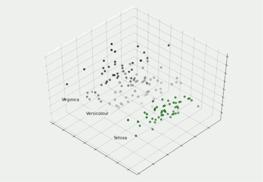
What kind of diagrams can be plotted with Plotly?
There are several types of charts used in Business Intelligence (BI) to represent data and help users visualize and analyze information. Here are some of the most common chart types:
- Bar charts: Bar charts are used to compare data across categories or groups and are one of the most common chart types in BI. While they are very similar to histograms, they should not be confused.
- Histograms: A histogram is a visualization form from the field of statistics that is used to illustrate frequency distributions. It involves counting the data points that fall into a defined group and then displaying their values in individual bars.
- Line charts: Line charts are used to show trends over time and are useful for visualizing changes in data over a period of time.
- Scatter plots: Scatter plots are used to show the relationship between two variables and are commonly used in BI to identify patterns and correlations.
- Heat maps: heat maps are used to represent data in color and are useful for highlighting patterns and trends in large data sets.
- Tree charts: used to represent hierarchical data, tree charts are used in BI to show the size and composition of different categories of data.
- Pie charts: Pie charts are used to show the composition of data and are suitable for showing proportions and percentages.
- Sankey charts: Sankey diagrams are used to visualize the flow of data or processes and are useful for understanding complex systems and processes.
- Bubble charts: Used to show the relationship between three variables, bubble charts are often used in BI to identify patterns and correlations.
These are just a few examples of the many types of charts used in business intelligence. The choice of chart type depends on the data to be analyzed, the goals of the analysis, and the user’s preferences.
What is Plotly Dash?
Plotly Dash is a Python framework for building web applications with interactive data visualizations. It is built on top of the Plotly library and allows users to easily create web applications with complex, interactive visualizations.
One of the key benefits of Dash is that it allows users to create custom web applications without the need for extensive web development experience. With Dash, users can build and deploy interactive web applications quickly and easily using Python code.
Dash provides a range of pre-built components, such as graphs, tables, and dropdowns, that can be easily customized and combined to create complex, interactive visualizations. Dash also allows users to create custom components using HTML, CSS, and JavaScript, providing users with a high degree of flexibility and customization.
Another benefit of Dash is that it supports real-time data streaming, allowing users to create live data visualizations that update in real-time. This is particularly useful for applications such as financial dashboards, where up-to-the-minute data is critical.
Dash also offers a range of deployment options, including cloud-based deployment on services such as Heroku and AWS, or self-hosting on a local server. This flexibility allows users to choose the deployment option that best suits their needs.
Overall, Plotly Dash is a powerful tool for creating web applications with interactive data visualizations. Its flexibility, ease of use, and support for real-time data streaming make it an ideal tool for a wide range of applications, from financial dashboards to scientific data analysis.
What are the differences between Plotly and Matplotlib?
Plotly and Matplotlib are both popular Python libraries used for data visualization, but they have some key differences:
- Visualization types: Matplotlib is primarily focused on static 2D plotting, whereas Plotly offers a wider range of visualization types, including 3D plots, interactive charts, and dashboards.
- Interactivity: Plotly is designed to create interactive visualizations that allow users to explore data in more detail, whereas Matplotlib is primarily used for creating static visualizations.
- Ease of use: Plotly is generally considered to be easier to use than Matplotlib, particularly when it comes to creating interactive visualizations. This is because Plotly provides pre-built templates and components that can be easily customized and combined to create complex visualizations, whereas Matplotlib requires more coding to create similar visualizations.
- Integration: Matplotlib is more widely integrated with other Python libraries and tools, whereas Plotly has more limited integration options. Matplotlib is often used in scientific computing workflows, while the other library is often used for web applications and data science dashboards.
- Licensing: Matplotlib is open-source and free to use, whereas Plotly offers both open-source and commercial licensing options.
Overall, both Plotly and Matplotlib are powerful tools for data visualization, but they have different strengths and use cases. Matplotlib is well-suited for creating static 2D plots, while Plotly is better suited for creating interactive visualizations and web applications.
What are basic commands used in Plotly?
Plotly is a powerful visualization library in Python that allows you to create interactive and visually appealing plots. Here are some basic Plotly commands with examples:
Adding Titles and Labels
In Plotly, adding titles and labels to your plots is straightforward and helps enhance the visual presentation of your data. To add a title to a plot, you can use the update_layout() method and specify the title parameter. For example:

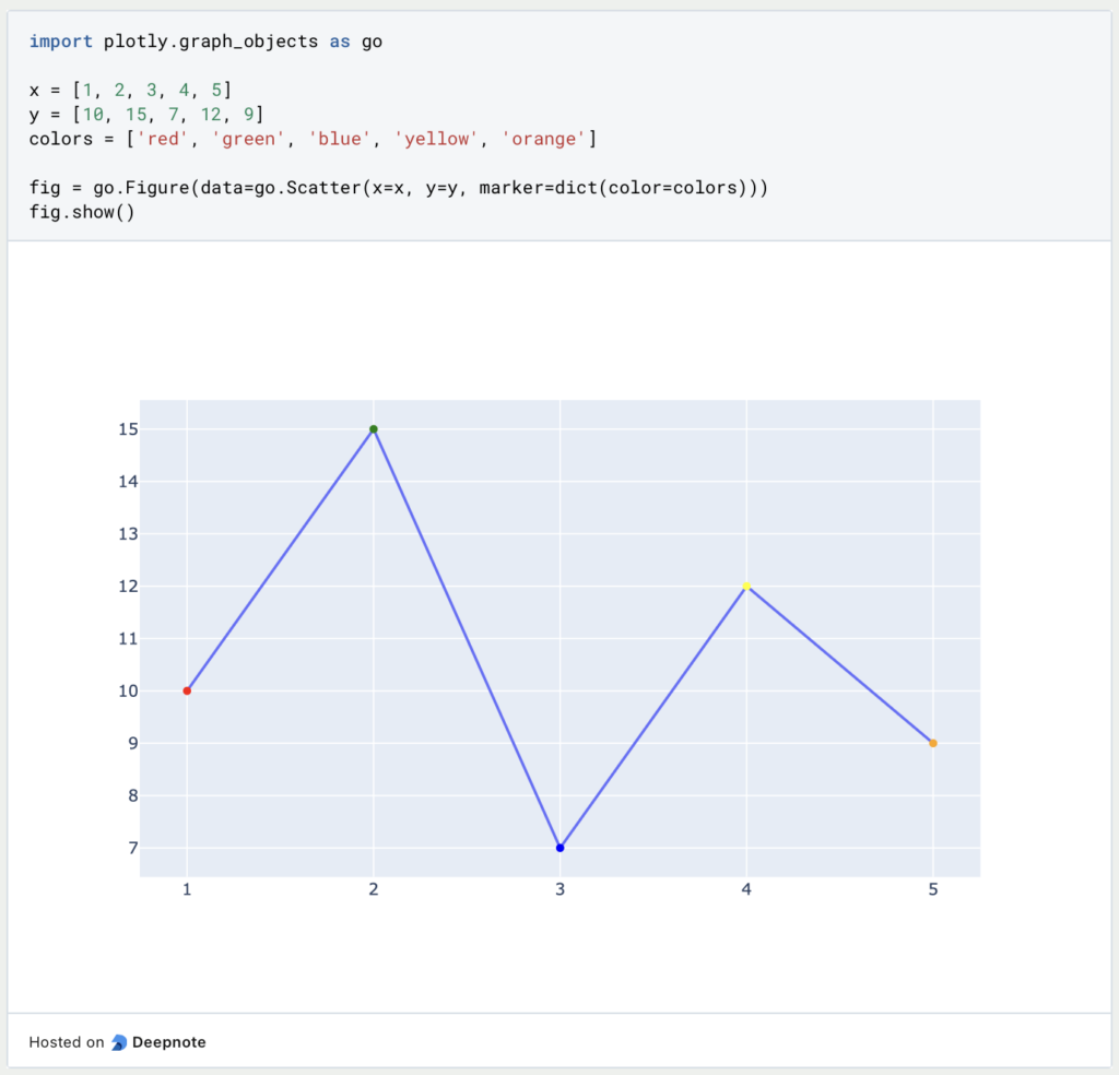
Customizing Marker Colors
In Plotly, you can easily change the marker colors in your plots to customize the visual representation of data points. Plotly provides a variety of options for specifying marker colors, including using a single color for all markers or using a sequence of colors based on a specific variable.
To change the marker color for all data points in a trace, you can use the marker parameter. For example, to create a scatter plot with red markers, you can do the following:
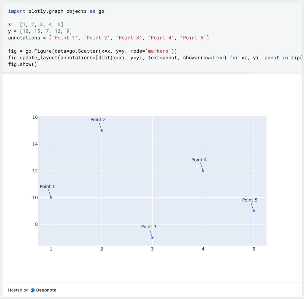
Adding Annotations
Adding annotations to Plotly plots allows you to provide additional information or context to your data visualizations. Annotations can include text, arrows, lines, and shapes, providing various ways to highlight specific data points or patterns in your plots. Here’s a section on how to add annotations in Plotly using Python:
To add annotations to your Plotly plot, you can use the add_annotation() method or the annotations parameter within the update_layout() method. Annotations are positioned using the x and y coordinates and can be customized with text, arrow attributes, and style options.
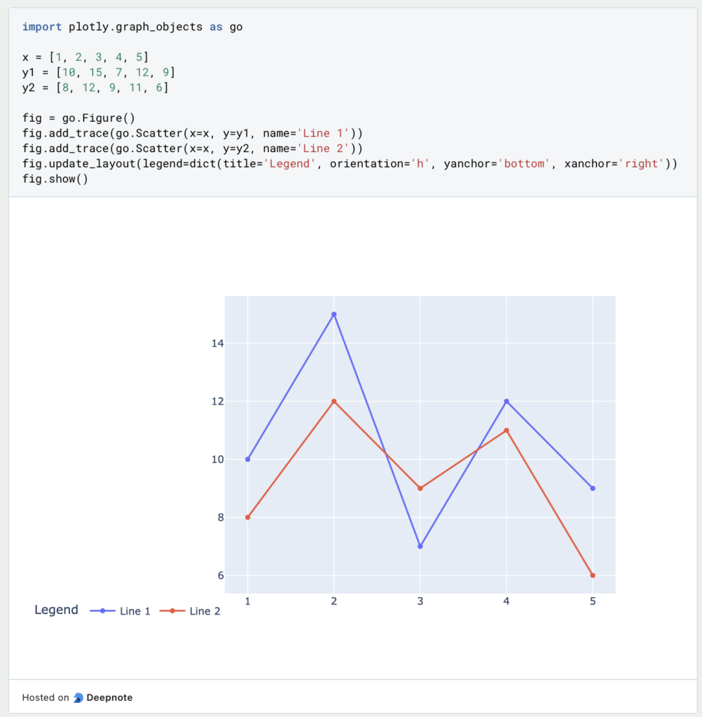
Adding Legends
Adding a legend to a Plotly plot is a straightforward way to provide information about the data series or traces displayed in the graph. Legends are essential for distinguishing between different data elements, especially when multiple traces are present in the same plot. Here’s a section on how to add a legend in Plotly using Python:
To add a legend to your Plotly plot, you can set the showlegend attribute to True in each trace you add to the figure. The legend will automatically appear, and you can customize its position, orientation, and other properties using the update_layout() method.
These examples showcase some basic Plotly commands to customize and annotate plots. Plotly offers a wide range of options to enhance your visualizations and make them more informative and engaging.
This is what you should take with you
- Plotly is a powerful data visualization library with a wide range of features and options.
- It provides an easy-to-use interface for creating interactive and dynamic plots.
- The library can be used for a variety of applications, from data exploration to scientific research.
- It supports many programming languages, including Python, R, and JavaScript.
- With the tool, you can easily share your visualizations online and collaborate with others.
- Overall, Plotly is a versatile tool for creating high-quality visualizations and gaining insights from your data.
Thanks to Deepnote for sponsoring this article! Deepnote offers me the possibility to embed Python code easily and quickly on this website and also to host the related notebooks in the cloud.

Learn Python: The Complete Guide for Beginners
Introduction: Learn Python with a clear starting point If you want to learn Python and have little or no programming experience, this guide gives you a practical starting point. You will learn what Python is, why beginners often choose it, which fundamentals matter most, and how to build a realistic learning path. Python is often… Read More »Learn Python: The Complete Guide for Beginners
Machine Learning with Python: Complete Tutorial with Scikit-Learn
Machine Learning with Python: What You Will Learn in This Tutorial Machine learning with Python has never been more accessible – and Scikit-Learn is the library that makes the entry point as smooth as it gets. In this tutorial you’ll learn what machine learning actually is, which core ideas you need to understand before writing… Read More »Machine Learning with Python: Complete Tutorial with Scikit-Learn

Python Programming Basics: Learn it from scratch!
Master Python Programming Basics with our guide. Learn more about syntax, data types, control structures, and more. Start coding today!

What are Python Variables?
Dive into Python Variables: Explore data storage, dynamic typing, scoping, and best practices for efficient and readable code.

What is Jenkins?
Mastering Jenkins: Streamline DevOps with Powerful Automation. Learn CI/CD Concepts & Boost Software Delivery.

What are Conditional Statements in Python?
Learn how to use conditional statements in Python. Understand if-else, nested if, and elif statements for efficient programming.
Other Articles on the Topic of Plotly
- This link will get you to my Deepnote App where you can find all the code that I used in this article and can run it yourself.

Niklas Lang
I have been working as a machine learning engineer and software developer since 2020 and am passionate about the world of data, algorithms and software development. In addition to my work in the field, I teach at several German universities, including the IU International University of Applied Sciences and the Baden-Württemberg Cooperative State University, in the fields of data science, mathematics and business analytics.
My goal is to present complex topics such as statistics and machine learning in a way that makes them not only understandable, but also exciting and tangible. I combine practical experience from industry with sound theoretical foundations to prepare my students in the best possible way for the challenges of the data world.